top of page
Chart Makeovers
Swipe left and right on the images below to see some suggestions on improving common visualization types.
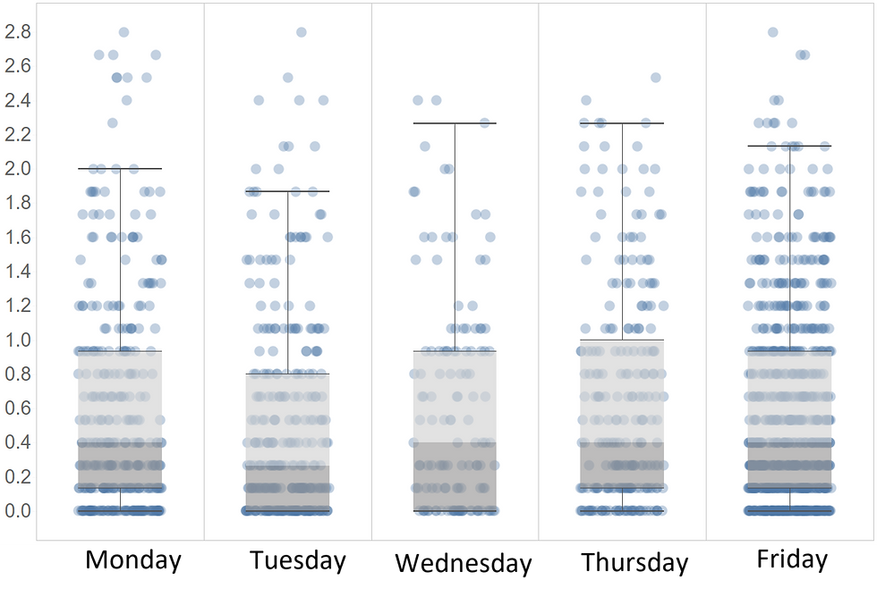
Use jitter to avoid overlapping the dots. Jittering is just a random shifting of the dots to the left and right that enables a better view of the data.

After

Before

After
1/2
Focus readers' attention on the essential information, which is changes over time, so we eliminated all unnecessary elements.

After

Before

After
1/2
People are much more accurate in comparing the length of the straight lines than sectors of the cycle.

Before

After

Before
1/2
Even experienced chart readers frequently have a hard time navigating through the double-axis. Consider showing the labels near the data points instead of on the axis.

After

Before

After
1/2
Comparing the surface of the rectangles is strenuous because it requires considering the two dimensions (width and height). A simple bar chart does a much better job.

After

Before

After
1/2
bottom of page