Correspondence analysis
- Oct 11, 2021
- 3 min read
Updated: Dec 10, 2021
Brand Image Mapping
Most brand managers know what their brands stand for and how they want to position them among the competitors. However, the desired brand image does not always match the way our targeted consumers see the brand. That’s why we do market research to assess the brand's current positioning and be able to plan the adjustments strategically.
How do we go about assessing brand image? The most obvious approach would be to assess your brand and your main competitors on a series of relevant brand image attributes, and see how your brand’s image is differentiated compared to the other brands. But, let’s say there are one or two big, dominant brands in the market. What is going to happen is they are going to stand out on all the brand image attributes. Does that mean your brand simply doesn’t differentiate itself in the market? Of course not. But, to properly assess brand positioning and neutralize the distorting effect of brand strength, we need to use correspondence analysis, sometimes also known as brand image mapping. The main focus of this post will be the correct interpretation of the results of correspondence analysis and potential usage of the results in brand management.
Key metrics: What do I need?
Main brand: „Which of the following brands do you use most often?“, „Who is your current service provider?“, „Which company’s services do you use the most?“
Prompted Brand Awareness: "Which of the following brands have you heard of? "
Brand Image: "Which of the following brands is best described by each of the following attributes? "
The main concepts: What should I know?
When exploring brand image, we usually want to include several brand image attributes (typically 8-16) and several brands (typically 3-8). The basic output is a pivot table with brand image attributes in the columns, brands in the rows, and the percentages of the respondents who associated each brand with the particular brand image attribute in the cells. Extracting insights from tables of that size is not easy, especially if we want to track changes over time, so we will want to visualize the results. That’s when the correspondence analysis comes into play.
The main feature of the correspondence analysis is reducing the original dimensions (i.e. attributes) to underlaying dimensions. The first underlying dimension carries most of the information, then the second one, and so on. That enables us to pick the first two underlaying dimensions, which carry majority of the information contained in the original attributes, and use them as the X and Y axis to plot the original attributes and brands. The processes under the hood are similar to principal component analysis, another dimension-reduction technique, but unlike the PCA, correspondence analysis works with categorical data.
The interpretation of the outcome: How should we read it?
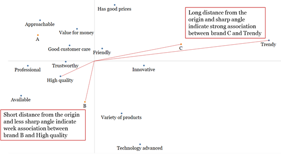
This is what the output of the correspondence analysis usually looks like:
The chart above is called brand image map (and it's made from real, white labeled data). It contains both the attributes and the brands (A, B and C), plotted on the first two underlaying dimensions. Brands are there so we can see their position on the map, while the attributes help us understand what the dimensions mean. For example, we might interpret the Y-axis as Affordable-Advanced, and the X-axis as Reliable-Modern.
While the first impulse tells us to interpret the proximity of the dots as a measure of the strength of the association, that is not the correct way to read the map. Remember that the visualization of the correspondence analysis is a projection of the n-dimensional (where n is the number of attributes) space onto the first two (most informative) dimensions. The two-dimensional intersection doesn't allow us to interpret all of the distances between the dots in the same way. What should you take into consideration while reading the map is a) the length of the distance from the origin (the longer the distance, the more interpretable the particular result is), b) sharpness of the angle between the imaginary lines connecting each dot with the origin (the sharper the angle, the stronger the association between two dots).

Luckily, we do not need a ruler and protractor for this task. There are simple mathematical formulas that can help us distinguish significant distances (and interpret them as associations) from those that are not.
Key take-aways: How can I use it?
We can monitor competitors’ positioning (see also switching analysis) and align brand strategy.
Correspondence analysis works well when combined with tracking studies, because it allows us to monitor the changes in image perception over time (and as the result of different marketing efforts that we make).
Correspondence analysis is helpful when evaluating the effects of marketing campaigns within a pretest-posttest survey design.


Comments